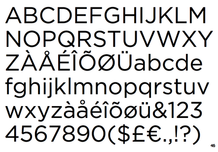
Hoefler & Co - Operator font

Ah the love for a typewriter based font…

H&Co discuss their design for a monospace typeface. Monospace (or “fixed-width”) typefaces have a unique place in the culture: their most famous ancestor is the typewriter, and they remain the style that designers reach for when they want to remind readers about the author behind the words. Typewriter faces have become part of the aesthetic of journalism, fundraising, law, academia, and politics; a dressier alternative to handwriting, but still less formal than something set in type, they’re an invaluable tool for designers. See link to see their short film on the font.

A monospace typeface, a monospace-inspired typeface, and a short film about type design.

Screen Shot 2020-06-16 at 15.13.24.png

MY MATCHBOXES

I’ve finally got my matchboxes up. In giving them a new home and cleaner glass, I noticed one I had not paid much attention to before. One of a red-crowned crane, a bird from the Hokkaidō region of Japan. This makes me think that they are probably mostly if not all, Japanese in origin.

IMG-6120.jpg
IMG-6118.jpg

The Mickey Mouse one is a particular favorite. So good to see them again. Now I just need to find a place for my other frames…

IMG-6125.jpg
IMG-6117.jpg


JAMES JARVIS

May the 4th.

Ah James. Who used to hand me a fresh, perfectly folded t-shirt, from the perfect warm pile in the airing cupboard ever time I stayed the night. Fond memories of his quality quirks like filling a rucksack with packing material to keep his rucksack in shape at all times. Or, not being able to wear the new trainers outside the house, due to uncertainty on the lace-up style. Hanging out, watching movies, admiring the interesting smell his 70’s smoky glass table gave off when wiped with a wet clean cloth after dinner, discussions on how vinyl should be categorized in their stacks or the genius of Richard Scary.

I particularly like this t-shirt he did for uniqlo. I always think of it, James and our mutual love for pental brush pens on May the 4th.

https://www.instagram.com/jamesjarvis/

Screen Shot 2020-05-04 at 10.27.22.png

G.F SMITH BRAND IDENTITY

After a conversation a while back with Rob from Healy’s Print, a surprise package arrived for me. It was a large small book. I mean it was small, A5 ish, but it was also large as it was chunky.

I stared at it. I couldn’t stop admiring it. It was handsome. I still cherish it, even a few years later. I almost can’t bear to touch it for the possibility of creasing something and ruining its perfectness.

So beautifully elegant in simplicity. It excels beyond a mere catalogue of paper stock.

Screen Shot 2020-05-04 at 01.37.35.png


Something has to be very incredible to be this good, when all is this stripped back. And this is a very rare occurrence. Apple take advantage of this scarcity to stand ahead. It’s even in their packaging, in the detail of the pressure when opening a new box, which is always perfect.

This sample book is Eric GIll in essence, from the typeface, to the bookbinding and the craft of the object. I often think of Gill’s statement that cheap manufacturers use ornament to hide cheap production. The opposite is also true. It is much to my dismay that the plainest most beautiful made objects, particularly clothes, are items way beyond my budget.

There was something about this book. Everything. Even the logo G.F Smith and it’s play on the i.

I stumbled across who designed it yesterday. Makes sense now.

And no, you can’t borrow it…sorry.

https://www.madethought.com/to-make/g-f-smith/

Screen Shot 2020-05-04 at 01.38.07.png
image © Madethought.com

image © Madethought.com

Source: https://www.madethought.com/to-make/g-f-sm...

PAUL SMITH'S MATCHBOXES

image © paul smith

image © paul smith

I have been getting ready to make space for my framed matchboxes this week and came across Paul Smith’s insta post today of his own vintage matchbox covers. I’ve never really thought what elements make them so appealing. But of course, he points out the obvious, it is the creativity in designing for such a small space.

Paul Smiths’ comments got me thinking. I believe there is another design element to these ephemeral items. Being a cheap and disposable object, the printing is generally simple, sometimes a mere one or two colours, to keep costs down. It is also the quality of the paper stock - rough, unlaminated, honest.

I have been animating graphics for a website, and the simplicity of these designs and colour-ways have been an inspiration to this current work.

insta

Source: https://www.instagram.com/p/B_vAJKAnJwz/?i...

RUTH ASAWA

IMG-5748.JPG
IMG-5728.JPG

Lovely exhibition of works by Ruth Asawa (1926–2013) at the David Zwirner gallery in London. Sculptures made of wire, constructed by various configurations of chain work. Her work seems at some moments 2D, like an ink drawing, the next moment 3D; maybe due to the breeze of a visitor walking by, disturbing their false flatness. Appearing solid, but partly see-through; they are an interesting mix or external forms becoming internal. The shadows added another quieter dimension to her work. On until 22 Feb.

IMG-5719.jpg
Source: https://www.davidzwirner.com/artists/ruth-...

CHARITY SHOP FINDS - BOOK FIND

CHARITY SHOP BOOK

I had a lovely catch up and many cups of tea with one of my childhood friends this week. Neither of us grew up around here, so it is lucky for me for her to live nearby. Strangely, we also both ended up having illustration degrees, so we both love going into charity and junk-shops to have a good rummage. I found a great vintage and near-perfect girls journal. It looks fifties in style. I am always amazed and inspired by how limitations of old printing, produced really creative styles. The illustrations are in the style of Edward Ardizzone’s pen and ink drawings and other images remind me of Edward Bawden’s stylized lino-cuts, while other drawings are duo-toned, my favorite being this wonderful owl. The cover itself is a wonderfully weird palette of colours. But elsewhere, it is inspiring how the use of a mere two colours has resulted in strong punchy illustrations. More is definitely less. There are a few full-colour plates in the middle of the book, and they are awful. A bargain for £2.50.

b93933c2-1ede-4327-a956-50d5d07dbd28.jpg
b9414520-077e-4e6c-952f-bdae103476c4.JPG
dd1bebd8-d759-4277-be2b-6df3431a4d83.jpg
f5d1367f-6ad9-4bea-9509-a4f93853c5cd.JPG
c2736b9b-691a-48bb-8a94-f0ac8f13aec3.jpg
IMG-5428.JPG

Jonathan Hoefler

For the love of fonts…

The Netflix series Abstract: The Art of Design just gets better the more you watch it. The documentary on Jonathan Hoefler is superb. The episode looks at many fonts in development at his studio, including Decimal (below), which was particularity inspiring, and I hope to use it in a project.

Gotham, the New Yorker Sans Gill, we have history, but all is forgiven…

Really looking forward to seeing his Black letter typeface re-invention in the future.

Decimal by Hoefler&Co.

Decimal by Hoefler&Co.

Decimal Extra Light by Hoefler&Co.

Decimal Extra Light by Hoefler&Co.

Chronicle Display Light by Hoefler&Co.

Chronicle Display Light by Hoefler&Co.

Gotham by Hoefler&Co.

Gotham by Hoefler&Co.

Source: https://www.typography.com/

Ozabu

I’ve been following Ozabu’s work this year. A self-taught artist, her drawings are staggeringly detailed, stylized and dreamy. Rendered with incredibly subtle line and tonal work in graphite on paper, her ghostly hauntings of form range from the beautiful to the macabre. Preferring to allow the work to speak for itself, Ozabu often avoids comment on her imagery, hoping the viewer will shape personal readings themselves.

IMG_5354.jpg
Source: https://www.instagram.com/ozabu/?hl=en

Javier Mariscal

Been looking again at Mariscal’s work today. I was very lucky to meet him in his studio in Barcelona, many moons ago. His studio was only found by following Mariscal’s graffiti, which led to many thin stray dogs, a dusty mud track and finally to a concealed hi-tech warehouse, which seemed more like a James Bond set than a studio. Previously famed as a comic strip artist, his talent extends to type, furniture, architecture and print. However, when I met him he was more interested in showing his privately funded pop video, featuring him 'singing’ beside some very glamorous models. When talking about his work for the Barcelona Olympics - he said he designed the mascot Cobi to look naked with a hairy chest. And he got away with it. Absolute legend.

Screenshot 2019-11-19 at 20.56.44.png
Screenshot 2019-11-19 at 20.56.23.png
Screenshot 2019-11-19 at 21.17.31.png
Screenshot 2019-11-19 at 21.22.27.png
Source: https://www.pinterest.co.uk/danielleblyde/...

Game Typography

Survey of ’70s, ’80s and early ’90s arcade game pixel typography. Exhaustively researched by author Toshi Omagari (a celebrated typeface designer at Monotype UK) Arcade Game Typography gathers together 250 pixel typefaces, all carefully chosen, extracted, redrawn and categorised by style, and each with an accompanying commentary by Omagari. The title also features 4 illustrated essays on videogame typography theory and practice, documenting the unique advantages and challenges presented to designers of these bold, playful and often quirky alphabets.

Screenshot 2019-11-15 at 12.58.22.png
Screenshot 2019-11-15 at 12.31.58.png
Source: https://readonlymemory.vg/shop/book/arcade...

Olafur Eliasson at Tate Modern

Screen Shot 2019-11-05 at 16.10.25.png

Visit to Olafur Eliasson exhibition. Tate Modern.

Finally, I got to see the exhibition by Icelandic artist Olafur Eliasson. It was as inspiring as the installation The Weather Project (2003) - the big sun - in the Turbine Hall, which is still my favorite work shown in that space. It is not a free exhibit- we went round twice. I highly recommend taking music and headphones, for me it would have heightened the experience in the fog room.

IMG_4541.jpg
Source: https://www.tate.org.uk/whats-on/tate-mode...