JAMES JARVIS

May the 4th.

Ah James. Who used to hand me a fresh, perfectly folded t-shirt, from the perfect warm pile in the airing cupboard ever time I stayed the night. Fond memories of his quality quirks like filling a rucksack with packing material to keep his rucksack in shape at all times. Or, not being able to wear the new trainers outside the house, due to uncertainty on the lace-up style. Hanging out, watching movies, admiring the interesting smell his 70’s smoky glass table gave off when wiped with a wet clean cloth after dinner, discussions on how vinyl should be categorized in their stacks or the genius of Richard Scary.

I particularly like this t-shirt he did for uniqlo. I always think of it, James and our mutual love for pental brush pens on May the 4th.

https://www.instagram.com/jamesjarvis/

Screen Shot 2020-05-04 at 10.27.22.png

PAUL SMITH'S MATCHBOXES

image © paul smith

image © paul smith

I have been getting ready to make space for my framed matchboxes this week and came across Paul Smith’s insta post today of his own vintage matchbox covers. I’ve never really thought what elements make them so appealing. But of course, he points out the obvious, it is the creativity in designing for such a small space.

Paul Smiths’ comments got me thinking. I believe there is another design element to these ephemeral items. Being a cheap and disposable object, the printing is generally simple, sometimes a mere one or two colours, to keep costs down. It is also the quality of the paper stock - rough, unlaminated, honest.

I have been animating graphics for a website, and the simplicity of these designs and colour-ways have been an inspiration to this current work.

insta

Source: https://www.instagram.com/p/B_vAJKAnJwz/?i...

CHARITY SHOP FINDS - BOOK FIND

CHARITY SHOP BOOK

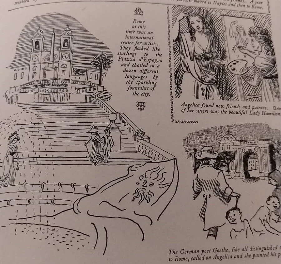
I had a lovely catch up and many cups of tea with one of my childhood friends this week. Neither of us grew up around here, so it is lucky for me for her to live nearby. Strangely, we also both ended up having illustration degrees, so we both love going into charity and junk-shops to have a good rummage. I found a great vintage and near-perfect girls journal. It looks fifties in style. I am always amazed and inspired by how limitations of old printing, produced really creative styles. The illustrations are in the style of Edward Ardizzone’s pen and ink drawings and other images remind me of Edward Bawden’s stylized lino-cuts, while other drawings are duo-toned, my favorite being this wonderful owl. The cover itself is a wonderfully weird palette of colours. But elsewhere, it is inspiring how the use of a mere two colours has resulted in strong punchy illustrations. More is definitely less. There are a few full-colour plates in the middle of the book, and they are awful. A bargain for £2.50.

b93933c2-1ede-4327-a956-50d5d07dbd28.jpg
b9414520-077e-4e6c-952f-bdae103476c4.JPG
dd1bebd8-d759-4277-be2b-6df3431a4d83.jpg
f5d1367f-6ad9-4bea-9509-a4f93853c5cd.JPG
c2736b9b-691a-48bb-8a94-f0ac8f13aec3.jpg
IMG-5428.JPG

Ozabu

I’ve been following Ozabu’s work this year. A self-taught artist, her drawings are staggeringly detailed, stylized and dreamy. Rendered with incredibly subtle line and tonal work in graphite on paper, her ghostly hauntings of form range from the beautiful to the macabre. Preferring to allow the work to speak for itself, Ozabu often avoids comment on her imagery, hoping the viewer will shape personal readings themselves.

IMG_5354.jpg
Source: https://www.instagram.com/ozabu/?hl=en

Javier Mariscal

Been looking again at Mariscal’s work today. I was very lucky to meet him in his studio in Barcelona, many moons ago. His studio was only found by following Mariscal’s graffiti, which led to many thin stray dogs, a dusty mud track and finally to a concealed hi-tech warehouse, which seemed more like a James Bond set than a studio. Previously famed as a comic strip artist, his talent extends to type, furniture, architecture and print. However, when I met him he was more interested in showing his privately funded pop video, featuring him 'singing’ beside some very glamorous models. When talking about his work for the Barcelona Olympics - he said he designed the mascot Cobi to look naked with a hairy chest. And he got away with it. Absolute legend.

Screenshot 2019-11-19 at 20.56.44.png
Screenshot 2019-11-19 at 20.56.23.png
Screenshot 2019-11-19 at 21.17.31.png
Screenshot 2019-11-19 at 21.22.27.png
Source: https://www.pinterest.co.uk/danielleblyde/...