G.F SMITH BRAND IDENTITY

After a conversation a while back with Rob from Healy’s Print, a surprise package arrived for me. It was a large small book. I mean it was small, A5 ish, but it was also large as it was chunky.

I stared at it. I couldn’t stop admiring it. It was handsome. I still cherish it, even a few years later. I almost can’t bear to touch it for the possibility of creasing something and ruining its perfectness.

So beautifully elegant in simplicity. It excels beyond a mere catalogue of paper stock.

Screen Shot 2020-05-04 at 01.37.35.png


Something has to be very incredible to be this good, when all is this stripped back. And this is a very rare occurrence. Apple take advantage of this scarcity to stand ahead. It’s even in their packaging, in the detail of the pressure when opening a new box, which is always perfect.

This sample book is Eric GIll in essence, from the typeface, to the bookbinding and the craft of the object. I often think of Gill’s statement that cheap manufacturers use ornament to hide cheap production. The opposite is also true. It is much to my dismay that the plainest most beautiful made objects, particularly clothes, are items way beyond my budget.

There was something about this book. Everything. Even the logo G.F Smith and it’s play on the i.

I stumbled across who designed it yesterday. Makes sense now.

And no, you can’t borrow it…sorry.

https://www.madethought.com/to-make/g-f-smith/

Screen Shot 2020-05-04 at 01.38.07.png
image © Madethought.com

image © Madethought.com

Source: https://www.madethought.com/to-make/g-f-sm...

CHARITY SHOP FINDS - BOOK FIND

CHARITY SHOP BOOK

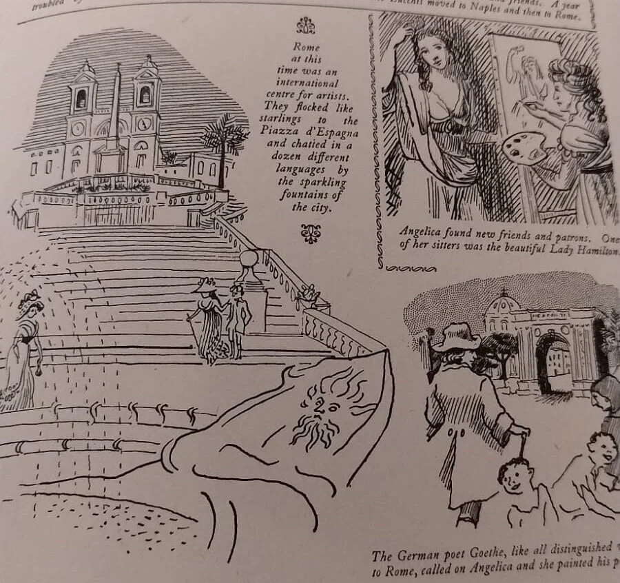
I had a lovely catch up and many cups of tea with one of my childhood friends this week. Neither of us grew up around here, so it is lucky for me for her to live nearby. Strangely, we also both ended up having illustration degrees, so we both love going into charity and junk-shops to have a good rummage. I found a great vintage and near-perfect girls journal. It looks fifties in style. I am always amazed and inspired by how limitations of old printing, produced really creative styles. The illustrations are in the style of Edward Ardizzone’s pen and ink drawings and other images remind me of Edward Bawden’s stylized lino-cuts, while other drawings are duo-toned, my favorite being this wonderful owl. The cover itself is a wonderfully weird palette of colours. But elsewhere, it is inspiring how the use of a mere two colours has resulted in strong punchy illustrations. More is definitely less. There are a few full-colour plates in the middle of the book, and they are awful. A bargain for £2.50.

b93933c2-1ede-4327-a956-50d5d07dbd28.jpg
b9414520-077e-4e6c-952f-bdae103476c4.JPG
dd1bebd8-d759-4277-be2b-6df3431a4d83.jpg
f5d1367f-6ad9-4bea-9509-a4f93853c5cd.JPG
c2736b9b-691a-48bb-8a94-f0ac8f13aec3.jpg
IMG-5428.JPG

Game Typography

Survey of ’70s, ’80s and early ’90s arcade game pixel typography. Exhaustively researched by author Toshi Omagari (a celebrated typeface designer at Monotype UK) Arcade Game Typography gathers together 250 pixel typefaces, all carefully chosen, extracted, redrawn and categorised by style, and each with an accompanying commentary by Omagari. The title also features 4 illustrated essays on videogame typography theory and practice, documenting the unique advantages and challenges presented to designers of these bold, playful and often quirky alphabets.

Screenshot 2019-11-15 at 12.58.22.png
Screenshot 2019-11-15 at 12.31.58.png
Source: https://readonlymemory.vg/shop/book/arcade...