Hoefler & Co - Operator font

Ah the love for a typewriter based font…

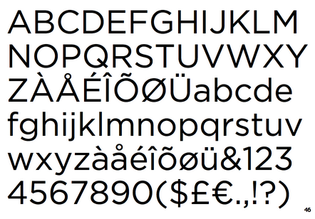
H&Co discuss their design for a monospace typeface. Monospace (or “fixed-width”) typefaces have a unique place in the culture: their most famous ancestor is the typewriter, and they remain the style that designers reach for when they want to remind readers about the author behind the words. Typewriter faces have become part of the aesthetic of journalism, fundraising, law, academia, and politics; a dressier alternative to handwriting, but still less formal than something set in type, they’re an invaluable tool for designers. See link to see their short film on the font.

A monospace typeface, a monospace-inspired typeface, and a short film about type design.

Screen Shot 2020-06-16 at 15.13.24.png

Jonathan Hoefler

For the love of fonts…

The Netflix series Abstract: The Art of Design just gets better the more you watch it. The documentary on Jonathan Hoefler is superb. The episode looks at many fonts in development at his studio, including Decimal (below), which was particularity inspiring, and I hope to use it in a project.

Gotham, the New Yorker Sans Gill, we have history, but all is forgiven…

Really looking forward to seeing his Black letter typeface re-invention in the future.

Decimal by Hoefler&Co.

Decimal by Hoefler&Co.

Decimal Extra Light by Hoefler&Co.

Decimal Extra Light by Hoefler&Co.

Chronicle Display Light by Hoefler&Co.

Chronicle Display Light by Hoefler&Co.

Gotham by Hoefler&Co.

Gotham by Hoefler&Co.

Source: https://www.typography.com/